|
Evaluating The Two-Income Trap Hypothesis:
As I've been working on my book on bankruptcy this summer, I've been going back through the various hypotheses that have been advanced for the rise in American bankruptcy filings in the 1980s and 1990s. One hypothesis was that advanced in The Two-Income Trap: Why Middle Class Mothers and Fathers are Going Broke by Professor Elizabeth Warren and Amelia Warren Tyagi.
Warren & Tyagi's argument can be easily summarized. They focus on the rise in the number of households with two parents working as an indication of economic distress. Conventional economic theory would indicate that one benefit of having a second wage-earner is that it will make the family more resilient to a financial setback or loss of job than a traditional family with only one wage-earner. Families today, unlike those a generation ago, can save the second earner's income as precautionary savings, thereby making it easier to withstand a setback.
Warren and Tyagi disagree with this conventional economic approach.
[To continue reading hidden text click "show"]
They argue that contrary to standard economic theory, the influx of a second worker has actually made a family more susceptible to economic setback. The argument is a bit opaque, but it seems to rest on the idea that recent decades have seen an excessive "bidding war" for housing, as families compete to get their children into preferred school districts. This bidding war for housing has, in turn, driven mothers from the home into the workplace, in order to earn sufficient income to pay the mortgage on high-priced homes. In turn, this increased female workforce participation has given rise to a whole new host of expenses, such as additional cars and child care expenses. In the end, Warren and Tyagi argue, the family is no more financially stable or well-off, because now both incomes are needed to pay for the house, as well as the necessary expenses associated with maintaining a two-income family, such as an additional car to get to work and daycare. Warren and Tyagi have dubbed this phenomenon the "two-income trap," which, at its core, is said to be driven by the rapid appreciation in housing prices. Because houses in good neighborhoods are expensive, thus in order to pay the mortgage, mom goes to work to supplement dad's income.
So although the second job brings in new income, it brings with it a whole new set of expenses, many of which are supposedly dedicated to sustaining mom's employment, such as child care expenses and another car. So the family ends up even more highly leveraged than previously and with a higher family income and two wage-earners, but counterintuitively, more vulnerable to financial setback than previously. Thus, there is sort of a prisoner's dilemma here--all families would be better off if they could commit to having only one wage-earner in the workforce, thereby keeping down the price of necessities, and especially housing, the alleged trigger for this arms'-race, and send the second worker into the workforce only in times of necessity. Yet, no family can afford to sit it out, because otherwise it will be left behind. So off they trudge, held hostage to the house and the ancillary expenses needed to maintain it.
Numerous questions could be raised about the theoretical assumptions that underlie their analysis, such as the unproven assertion that the rise in two-working-parent families is caused primarily by a housing bidding war. Scholars have provided several plausible explanations for the rise in two-working-parent families, such as smaller family size (which reduces the economies of scale in one parent specializing in child-rearing) or the philosophical and intellectula revolution of feminism, which simply empowered women who wanted to work to do so. Warren and Tyagi do not discuss these competing theories or why their theory is more accurate than these alternatives.
There is also the obvious questions of causation--having more income surely causes at least some families to increase their expenses by buying larger houses, houses in more expensive neighborhoods, or newer and more expensive cars than they might otherwise. For instance, data from the Survey of Consumer Finances suggests that households were buying more expensive cars around 2000--the time period Warren and Tyagi study--than in the past, especially more expensive SUVs and luxury cars. See Ana M. Aizcorbe et al., Recent Changes in U.S. Family Finances: Evidence from the 1998 and 2001 Survey of Consumer Finances, 89 FED. RES. BULL. 1, 17 (2003). To a substantial extent, this decision to buy more expensive cars or more expensive houses was because households were wealthier than before because of massive increases in the stock market and home equity, and consumers borrowed against that wealth to increase their consumption. In addition, the rise in home ownership rates between the 1970s and today has added more highly-leveraged borrowers into the measurement pool, thereby tending to increase the measured housing obligation for the average family as well by moving them from renting to owning (also, of course, giving them an extremely valuable wealth accumulation asset). The growth in home ownership in the past decade is charted here.
But let's aside detailed discussion of the questions of theory and focus on whether the hypothesis is valid as an empirical matter.
But despite all of these caveats, we will still treat increases in mortgage and automobile expenses as exogenous and causal variables. Warren and Tiyagi's argument rests on a stylized example of the situation facing a "typical" middle class family today versus a generation ago (I apologize for the length of the excerpt, but the book itself presents the core data in a discursive manner). All figures are inflation adjusted:
We offer two examples.
We begin with Tom and Susan, representatives of the average middle-class family of a generation ago [early 1970s]. Tom works full-time, earning $38,700, the median income for a fully employed man in 1973, while Susan stays at home to care for the house and children. Tom and Susan have the typical two children, one in grade school and a three-year-old who stays home with Susan. The family buys health insurance through Tom's job, to which they contribute $1,030 a year--the average amount spent by an insured family that made at least some contribution to the cost of a private insurance policy. They own an average home in an average family neighborhood--costing them $5,310 a year in mortgage payments. Shopping is within walking distance, so the family owns just one car, on which it spends $5,140 a year for car payments, maintenance, gas, and repairs. And like all good citizens, they pay their taxes, which claim about 24 percent of Tom's income. Once all the taxes, mortgage payments, and other fixed expenses are paid, Tom and Susan are left with $17,834 in discretionary income (inflation adjusted), or about 46 percent of Tom's pretax paycheck. They aren't rich, but they have nearly $1,500 a month to cover food, clothing, utilities, and anything else they might need.
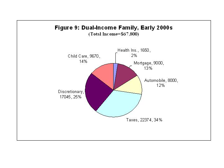
So how does our 1973 couple compare with Justin and Kimberly, the modern-day version of the traditional family? Like Tom, Justin is an average earner, bringing home $39,000 in 2000--not even 1 percent more than his counterpart of a generation ago. But there is one big difference: Thanks to Kimberly's full-time salary, the family's combined income is $67,800--a whopping 75 percent higher than the household income for Tom and Susan. A quick look at their income statement shows how the modern dual-income couple has sailed past their single-income counterpart of a generation ago.
So where did all that money go? Like Tom and Susan bought an average home, but today that three-bedroom-two-bath ranch costs a lot more. Their annual mortgage payments are nearly $9,000. The older child still goes to the public elementary school, but after school and during summer vacations he goes to day care, at an average yearly cost of $4,350. The younger child attends a full-time preschool/day care program, which costs the family $5,320 a year. With Kimberly at work, the second car is a must, so the family spends more than $8,000 a year on its two vehicles. Health insurance is another must, and even with Justin's employer picking up a big share of the cost, insurance takes $1,650 from the couple's paychecks. Taxes also take their toll. Thanks in part to Kimberly's extra income, the family has been bumped into a higher bracket, and the government takes 33 percent of the family's money. So where does that leave Justin and Kimberly after these basic expenses are deducted? With $17,045--about $800 less than Tom and Susan, who were getting by on just one income.
Reading that excerpt, I thought, "Hmm, that's confusing. I wonder why they listed the actual dollar values for all of the other expenses, but the 'percentage' of income spent on taxes. That makes it difficult to compare to make an apples to apples comparison of the actual tax burdens between the two periods." Presenting it in this manner is even more confusing because the authors then go on to implicitly convert tax obligations to dollar values in order to calculate the total amount of the families' budgets dedicated to aggregate "fixed costs" versus "discretionary spending," concluding thtat the 2000s couple has less left over for discretionary spending than the prior generation. Yet, although they report the actual dollar values for everything else, in an apparent oversight, they never actually report the actual dollar figures for the tax expenditures in the two periods.
So I got out my handy calculator and calculated what the indicated percentage of taxes translates into in terms of actual dollars paid in taxes. In turns out that for the 1970s family, paying 24% of its income in taxes works out to be $9,288. And for the 2000s family, paying 33% of its income (a higher rate presumably because of progressivity hitting the second wage-earners income) in taxes works out to be $22,374.
Thus, taxes increase in the example by $13,086. By contrast, annual mortgage obligations increased by only $3690 and automobile obligations by $2860 and health insurance $620. Those increases are not trivial, but they are swamped by the increase in tax obligations. Too put this in perspective, the increase in tax obligations is over three times as large as the increase in the mortgage (the supposed driver of the "two income trap") and about double the increase in the combined obligations of mortgage and automobile payments. This also leaves aside the peculiarity that the 2000s family is paying $9670 in new child care and $2860 in new automobile expenses supposedly to meet a $3690 increase in mortgage expenses, the supposed driver of the model.
Indeed, because of this huge increase in the tax bite, the percentage of family income dedicated to payments for health insurance, mortgage, and automobiles actually fell between the two periods. Consider the following charts taken from my article "An Economic Analysis of the Consumer Bankruptcy Crisis" (I used the actual dollars to calculate this, which because of rounding errors lead to the percentages being a bit off):
First, consider the "average family" of the 1970s:
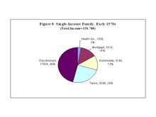
As can be seen, for the 1970s family, health insurance is 3% of income, mortgage payments 14%, and automobile expenses 13% of income.
Compare the "average family" of the 2000s:

As can readily be seen, expenses for health insurance, mortgage, and automobile, have actually declined as a percentage of the household budget. Child care is a new expense. But even this new expenditure is about a quarter less than the increase in taxes. Moreover, unlike new taxes and the child care expenses incurred to pay them, increases in the cost of housing and automobiles are offset by increases in the value of real and personal property as household assets that are acquired in exchange.
Overall, the typical family in the 2000s pays substantially more in taxes than in their mortgage, automobile expenses, and health insurance costs combined. And the growth in the tax obligation between the two periods is substantially greater the growth in mortgage, automobile expenses, and health insurance costs combined. And note, this is using the data taken directly from Warren and Tiyagi's book.
It is not clear what to make of all of this, except that it is hard to see how this confirms the central hypothesis of "The Two-Income Trap" that "necessary" expenses such as mortgage, car payments, and health insurance are the primary draing on the modern family's budget. And again, this unrealistically assumes that all increased spending on houses and cars is exogenously determined, ignoring the possibility that an increase in income leads to an endogenous decision by some households to increase their expenditures on items such as houses and cars.
Instead, Warren and Tiyagi's data, point to the conclusion that the obvious problem for this "typical" American family appears to be an extremely high tax burden caused primarily by the progressive nature of the income tax that hits families with two working adults by kicking them into higher marginal tax rates.
This conclusion is obscured by the confusing way in which the data is presented in "The Two-Income Trap." Whereas the book presents all of the other figures in terms of dollar values, expenditures on taxes is presented in terms of percentages. This stylistic decision unfortunately makes it difficult ot recognize that this increase in taxes is the primary factor causing the drop in "discretionary income" between the two time periods. It is not obvious why exactly the authors presented only this one particular entry in terms of percentages rather than actual dollars, which obscures what is going on by making it more difficult to understand exactly how much of the family budget was allocated to paying taxes versus these other expenditures. And even though the actual dollar value for taxes is later used to calculate the fixed and discretionary portions of the family budget, that figure is not reported anywhere in the book itself. Converting percentages to dollars, however, it is evident that the percentage of income dedicated to tax payments is by far the biggest difference between the "typical" family of the 1970s versus that of the 2000s. In the end, this confusing presentation seems to have led to overall confusion about the lessons of the book.
Finally, this confusion about the underlying dynamic also leads to confusion about policy recommendations. In particular, although Warren and Tyagi do not make this argument, it would seem to follow that one logical policy implication of this analysis would be to support a lower and flatter marginal tax rate. This would reduce the household tax burden and increase available discretionary income.
The Two-Income Tax Trap:
Yesterday I published in the Wall Street Journal a column entitled the "Two-Income Tax Trap" which was derived from my earlier post here.
I have received a few emails pointing out that in the column, it is unclear what taxes are included in the percentages listed. To clarify, in the book that provides the figures, the percentages (24% in the 1970s and 33% in the 2000s) refer to the total of all federal, state, and local taxes. But the growth in the tax burden between the two periods is largely a result of the growth in the federal income tax portion of the tax bill and the fact that the wife's income pushes the family into a more progressive tax bracket.
An Even More Confusing Presentation of the Two-Income Trap and Taxes:
In my first post on the "two-income trap" and in my Wall Street Journal column, I took note of the peculiar way in which the authors presented their data, which led them to overlook the crucial role of the rise in tax liabilities between the two periods and the impact that has on the average family's household finances. When the Warren & Tyagi compare the average family of the 1970s to the 2000s, they present the data on all expenses (mortgage, cars, health insurance) in terms of the change in the actual dollar expenditures between the two periods. The rise in the tax burden, however, is incongruously presented in terms of the percentage of household income dedicated to paying all taxes (federal, state, and local). Thus, the authors state that the percentage of household income paid in taxes increases from "24 percent" of household income to "33 percent" of household income.
As I noted, the difficulty with presenting the data in this manner is that it obscures the underlying dynamic of what is happening in the example. Adding the second worker increases household income by 75 percent--this is actually a greater increase than the expenditures on mortgage, automobiles, and health insurance, all of which increase by less than the income growth of 75 percent. The problem is that total tax obligations over this period increase from about $9000 to about $22,000--an increase of about 140 percent. Thus, assuming that the authors' argument is theoretically sound (a proposition open to question) it seems clear that the increase in tax obligations is the driving dynamic in their example.
Nonetheless, the authors apparently even confused themselves, as they completely ignore this massive growth in the tax burden on the household budget, even though use the actual dollar values in calculating the "fixed costs" portion of the average family budget. Apparently this idiosyncratic presentation style confused most readers as well, as even though the book was reviewed and featured in a large number of mainstream media outlets, it appears that none of those commentators observed the growth in the tax burden either. A list of reviews of the book, with links, is available here.
Fortunately, the authors presented all of the raw figures necessary to convert the percentages to actual dollar values, which made it possible to figure out that the importance of the growth in the tax burden.
Now I see that in May 2007, Professor Warren provided testimony before the United States Senate Finance Committee on the same topic. At the hearing, Professor Warren presents all of the data in the book in a different format--but the end result is that she actually presents the data on taxes in an even more confusing and idiosyncratic style than in the book, making it even more difficult to understand the underlying dynamic.
In her Senate testimony, Professor Warren no longer actually presents the actual dollar values for the changes in expenditures between the two periods. Instead, she presents the data for everything but taxes in terms of the percentage change in the amount expended by the household on various categories of the household budget. So, for instance, she reports that the average family now spends "32% less" on clothing, "18% less" on food, "52% less" on appliances, etc., than the family of a generation ago. They also spend "76% more" on mortgage payments, "74% more on health care" and "52% more" on automobiles than in the past (the data here is apparently updated from the presentation in the book). She also notes that families are spending more on electronics, such as DVD players, televisions, and computers. As before, she then recalibrates all of these percentages into a figure for "fixed costs" and "discretionary expenditures" that actually uses the actual dollar values, rather than these percentages. Moreover, she never indicates what percentage of the household budget each of these categories comprise, so it is difficult to figure out what impact these percentage changes in isolation have on the overall household budget.
But here's where it gets confusing. For each of these other expenditures, she present the percentage change in the actual amount of money the household actually pays for each of these obligations. If a similar measure were used for taxes, as noted above, it would indicate a massive increase of about 140% in tax obligations over the relevant period, which would make clear that this increase dwarfs the increase in every other expenditure.
But for the presentation in the change in taxes alone--Professor Warren presents the change in the "average tax rate"--the percentage change in the percentage of household income dedicated to paying taxes. So, under this approach, because tax obligations increase from 24% of household income to 33% of household income--and increase of 9 percentage points--she reports the change in "the average tax rate" between the two periods as being 25%. But had she applied the same methodology to taxes as she does to every other expenditures--i.e., the growth in actual household expenditures on various categories of goods and services, rather than the percentage change in the percentage of the household budget dedicated to a particular category of expenditures--the "apples to apples" comparison in the have been about 140%, not 25%.
If she applied to the other categories of expenditures the same methodology she applied to taxes (the percentage change in the percentage of the budget dedicated to those expenditures), then each would have actually declined or stayed approximately the same as a percentage of household income than previously, so they would be either zero or negative, while taxes would have increased by 25%. Instead, she presents a true apples to oranges comparison with absolutely no resemblance to one other for purposes of comparison.
In fact, this confusion leads to a misreporting of the data in Figure 3 of her testimony, which is labeled "Median Family Spending by Category, Percent Change, 1972-2005." She does in fact reporting the percent change in "family spending" for each of the other categories, she does not do so for taxes. But what is reported for taxes quite plainly is not the percent change in spending on taxes--it is the percent change in the percentage of the household budget dedicated to paying taxes, a completely different and unrelated number.
I don't know why all of this is presented in the way it is, but it doesn't make any sense to me. Presumably Professor Warren understands that the data she reports for taxes is not based on the same methodology as for all expenditures. And I assume that she is aware that the change in the "median family spending" on the category of taxes is actually about 140%, not 25%, such that the number reported in her Figure 3 is incorrect. More fundamentally, I don't understand why it is thought useful to put any expenditure in terms of the percentage change in the percentage of the household budget dedicated to a given category expenditure. And if that is useful, why would it be useful only for reporting taxes but not for any other category of expenditures?
Perhaps there is some logical reason why it makes sense to present the data in this peculiar and heterogeneous fashion. But if so, it is not obvious to me. As a result, it makes even more difficult to understand what is going on than even the original presentation, which already seemed to have been confusing to most readers (and perhaps even the authors themselves). I just don't understand why this one obligation--taxes--is consistently presented in a unique fashion that invariably makes it more difficult to understand what is going on with that expenditure from the household budget and thus to understand how the change in the tax burden compares to the changes in the burdens of other expenditures. And in fact, it seems likely that the average Senate Finance Committee member or staffer would be likely to look at this presentation and be misled into concluding that the increase in the tax burden is a relatively small part of the overall change in the household financial burden, when in fact it is the largest change.
Furthermore, unlike the previous presentation of the data, where one could at least replicate what was going based on the information provided (however obscurely), in this iteration the actual dollar values expended on various budget items are never presented, nor are the percentages of the household budget dedicated to certain expenditure categories (which would allow one to back out those values from the total income figures which are presented). In fact, from what I can tell, Professor Warren never even presents in her testimony the 24% and 33% figures for the percentage of the family budget dedicated to taxes, which I had to infer from her book that was where her new 25% figure of the percentage change in the percentage of income dedicated to tax payments is coming from. As a result, it is unclear in her testimony exactly how much the tax obligations rise, but the underlying expenditures on taxes seem to be basically the same as the original data on this score.
By suggesting that the increase in household expenditures on taxes is only 25%, rather than its actual increase in value of about 140%--Professor Warren's testimony unfortunately leaves the Senate with the impression that the growth in tax obligations is much smaller than the growth in categories such as mortgage and health care expenses, when in fact the growth in taxes is much, much larger and more important. Whatever the rationale for reporting the data in this fashion it appears to have once again confused the logical policy recommendations that follow. Professor Warren recommends five types of policy responses to her version of the "two-income trap," that range from the affordability of health care and college education, to improvements in education and public schools, and a novel proposal for government "safety regulation for credit products." All of these may or may not be sensible ideas, but they seem like they'd have a relatively minor impact on this particular problem when compared to the elephant in the room--taxes. This is especially so given that government at all levels could do something about the tax burden much more easily, with greater direct impact, and with fewer unintended consequences than trying to address these more difficult social problems.
Because Professor Warren either does not recognize or for some reason simply chose not to report the massive contribution of increased taxes to the overall household budget crunch, none of her policy recommendations address the dramatically increased tax burden, which as we have seen, is the underlying factor driving the whole two-income (tax) trap. Moreover, it goes without saying that if the average tax burden had increased at the same rate as income during this period (75% instead of 140%), then this would provide a huge amount of money for savings, for college, to pay for a home, or to pay for the other household expenses she enumerates. Or, at least, tax reform seems like it is worthwhile to at least consider in this context.
More generally, I still don't really understand why this data is presented in such a heterogeneous and confusing manner, especially when it consistently leads to confusion about what it actually demonstrates. Furthermore, this confusion results in policy recommendations that don't seem to follow from what the data actually show. It seems like it would be more effective to just pick a uniform presentation format and use that for all of the numbers, thereby permitting a more transparent comparison among them.
Robert Frank Falls For the Two-Income Trap:
In today's Washington Post, Robert Frank writes:
But while Congress clearly should not rescue borrowers who lied about their incomes or tried to get rich by flipping condos, such borrowers were at most a minor factor in this crisis. Primary responsibility rests squarely on regulators who permitted the liberal credit terms that created the housing bubble.
Hints of how things began to go awry appeared in "The Two-Income Trap," a 2003 book in which Elizabeth Warren and Amelia Warren Tyagi posed this intriguing question: Why could families easily meet their financial obligations in the 1950s and 1960s, when only one parent worked outside the home, yet have great difficulty today, when two-income families are the norm? The answer, they suggest, is that the second incomes fueled a bidding war for housing in better neighborhoods.
It's easy to see why. Even in the 1950s, one of the highest priorities of most parents was to send their children to the best possible schools. Because the labor market has grown more competitive, this goal now looms even larger. It is no surprise that two-income families would choose to spend much of their extra income on better education. And because the best schools are in the most expensive neighborhoods, the imperative was clear: To gain access to the best possible public school, you had to purchase the most expensive house you could afford.
But what works for any individual family does not work for society as a whole. The problem is that a "good" school is a relative concept: It is one that is better than other schools in the same area. When we all bid for houses in better school districts, we merely bid up the prices of those houses.
In the 1950s, as now, families tried to buy houses in the best school districts they could afford. But strict credit limits held the bidding in check. Lenders typically required down payments of 20 percent or more and would not issue loans for more than three times a borrower's annual income.
In a well-intentioned but ultimately misguided move to help more families enter the housing market, borrowing restrictions were relaxed during the intervening decades. Down payment requirements fell steadily, and in recent years, many houses were bought with no money down. Adjustable-rate mortgages and balloon payments further boosted families' ability to bid for housing.
The result was a painful dilemma for any family determined not to borrow beyond its means. No one would fault a middle-income family for aspiring to send its children to schools of at least average quality. (How could a family aspire to less?) But if a family stood by while others exploited more liberal credit terms, it would consign its children to below-average schools. Even financially conservative families might have reluctantly concluded that their best option was to borrow up.
Professor Frank has missed the ball on this one. As I observed in the Wall Street Journal last August in my column "The Two Income-Tax Trap" the math behind this simply doesn't add up--using Warren and Tyagi's own numbers:
The argument is developed in the book, "The Two Income Trap: Why Middle Class Mothers and Fathers are Going Broke," by Harvard Law School Professor Elizabeth Warren and her daughter Amelia Tyagi. In fact, using their own numbers, it is evident that they have overlooked the most important contributor to the purported household budget crunch — taxes.
Ms. Warren and Ms. Tyagi compare two middle-class families: an average family in the 1970s versus the 2000s (all dollar values are inflation-adjusted). The typical 1970s family is headed by a working father and a stay-at-home mother with two children. The father's income is $38,700, out of which came $5,310 in mortgage payments, $5,140 a year on car expenses, $1,030 on health insurance, and income taxes "which claim 24% of [the father's] income," leaving $17,834, or about $1,500 per month in "discretionary income" for all other expenses, such as food, clothing, utilities and savings.
The typical 2000s family has two working parents and a higher income of $67,800, an increase of 75% over the 1970s family. But their expenses have also risen: The mortgage payment increases to $9,000, the additional car raises the family obligation to $8,000, and more expensive health insurance premiums cost $1,650. A new expense of full-time daycare so the mother can work is estimated at $9,670. Mother's income bumps the family into a higher tax bracket, so that "the government takes 33% of the family's money." In the end, despite the dramatic increase in family income, the family is left with $17,045 in "discretionary income," less than the earlier generation.
The authors present no explanation for why they present only the tax data in their two examples as percentages instead of dollars. Nor do they ever present the actual dollar value for taxes anywhere in the book. So to conduct an "apples to apples" comparison of all expenses, I converted the tax obligations in the example from percentages to actual dollars.
In fact, for the typical 1970s family, paying 24% of its income in taxes works out to be $9,288. And for the 2000s family, paying 33% of its income is $22,374.
Although income only rose 75%, and expenditures for the mortgage, car and health insurance rose by even less than that, the tax bill increased by $13,086 — a whopping 140% increase. The percentage of family income dedicated to health insurance, mortgage and automobiles actually declined between the two periods.
During this period, the figures used by Ms. Warren and Ms. Tyagi indicate that annual mortgage obligations increased by $3,690, automobile obligations by $2,860 and health insurance payments by $620 (a total increase of $7,170). Those increases are not trivial — but they are swamped by the increase in tax obligations. To put this in perspective, the increase in tax obligations is over three times as large as the increase in the mortgage payments and almost double the increase in the mortgage and automobile payments combined. Even the new expenditure on child care is about a quarter less than the increase in taxes.
Overall, the typical family in the 2000s pays substantially more in taxes than the combined expenses of their mortgage, automobile and health insurance. And the change in the tax obligation between the two periods is substantially greater than the change in mortgage, automobile expenses and health-insurance costs combined.
Isolating just the mortgage burden, according to Warren & Tyagi's figures the percentage of family income dedicated to mortgage payments actually declined from the 1970s to 2000s, from 14% of household income ($5310 of $38,700) to 13% of household income ($9000 of $67,800). Again, this is using Warren & Tyagi's own figures.
I learned after writing the column that there is some dispute about the source of the rising tax burden. I followed Warren and Tyagi's lead from the book and attributed the growth in the tax burden primarily to the second-earner bias. Subsequently I found that there is some dispute about the extent to which the growth in the tax burden is attributable to income taxes rather than state and local taxes (including state income taxes). What has not been questioned is that Warren and Tyagi's own numbers show that the growth in the overall household tax burden overwhelms the growth in home mortgage expenses with respect to its impact on the household bottom line.
I like some of Bob Frank's work, especially back before he started writing his really political stuff. But I'm afraid on this one he fell into the two-income trap.
Update:
There is some confusion over whether Warren and Tyagi's analysis refers to marginal or average tax rates. It is average. In a long post on which the WSJ column was based I quoted the relevant excerpt from the book The Two-Income Trap (for those who don't have ready access to the book itself). As I noted in that post, the increase in taxes (in dollar terms) is more than three times greater than the increase in mortgage payments (the supposed driver of the "two-income trap"). I present the budget analysis graphically there as well.
|
|